Blog

The Devil is in the Detail at Dark Mofo

Dark. Mysterious. Stimulating. Confronting. Tragic. Dark Mofo in Hobart, Tasmania, is all of these and more. The best thing happening right now, culturally, anywhere, as far as I am concerned. Art, music, theatre, immersive ‘experiences’, it’s all there without really being ‘there’ at all. It’s magnificent and beguiling in its scale, style and substance, but you’ve probably heard much of that elsewhere.

IMG_7736

For me, the joy of Dark Mofo is in the purity of a single idea, beautifully and consistently and unwaveringly executed across every brand touchpoint. Even as I use the word ‘brand’ I shudder, as I’m sure anyone working at DarkLab – the creative studio for Dark Mofo – might. It seems such an inappropriately mundane word for such a fuck-you festival. Be this as it may, the attention to detail, everywhere, is simply astonishing. It’s in your pre-festival experience – the instagrams and e-newsletters beautifully considered both in design and expertly-written content. The enigmatic text messages inviting you to be part of something ‘secret’ -  if you wish, putting a smile on your face before you’ve even packed your smalls. It’s in the enigmatic message greeting you atop the terminal building, before you’ve even steeled yourself with a deep breath and stepped off the plane.

IMG_7781

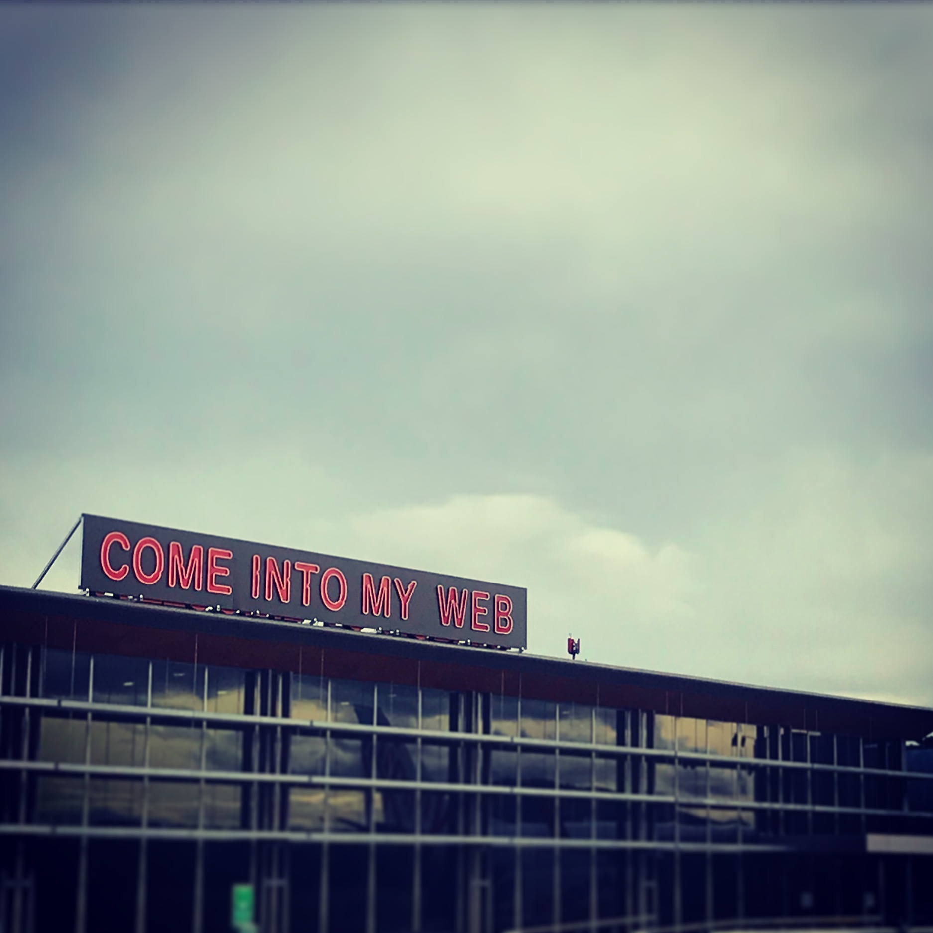
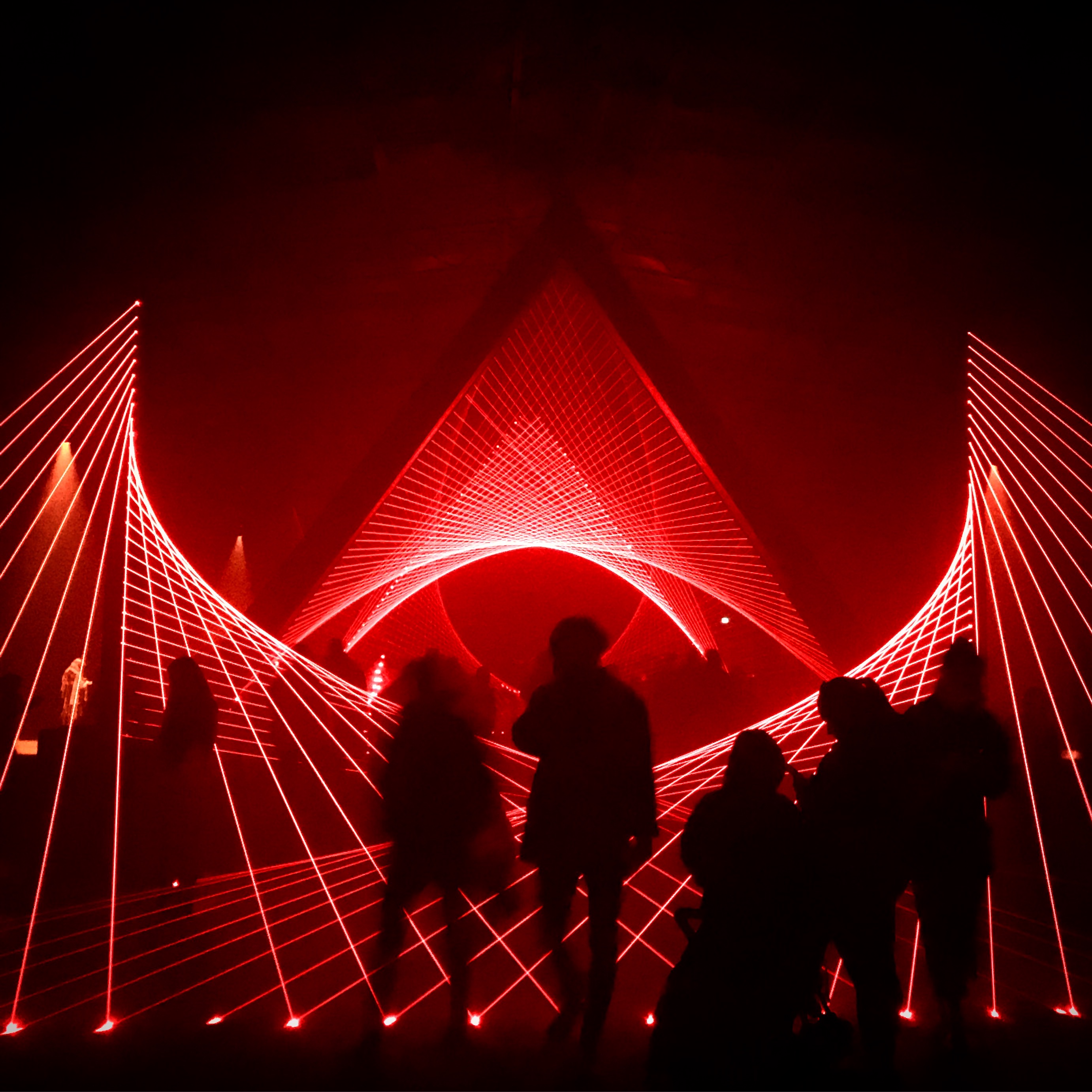
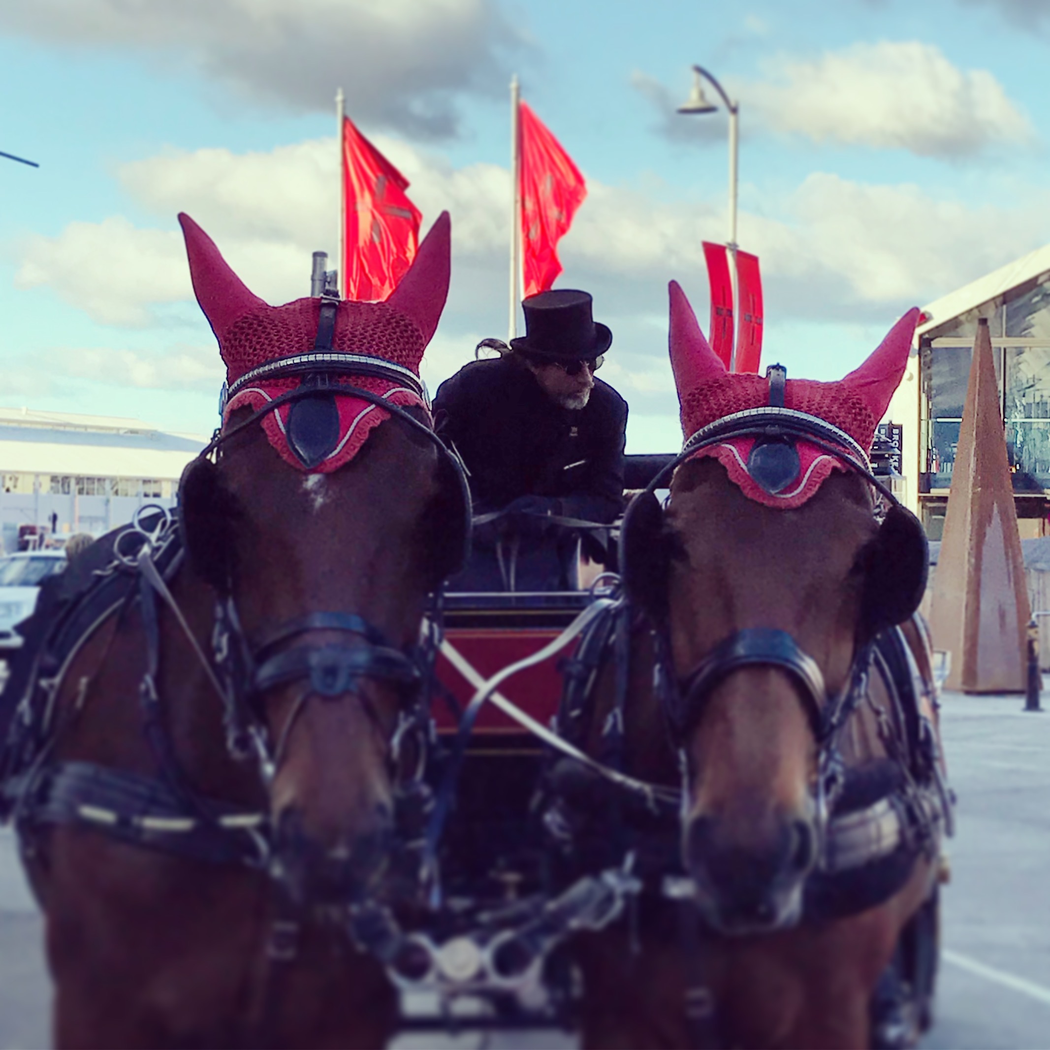
It’s in the wayfinding, signage and graphics all around town, it’s in the toilets of the ferry terminal with its lighting altered to the distinctly red Dark Mofo glow. It’s in the choice and colour of materials that dress the spaces, the curtains, the lighting, the bar menu, the horses taking people for a canter around town. The goddamn horses, people! They were sporting pointy red devil’s ears.

IMG_7632

IMG_7478

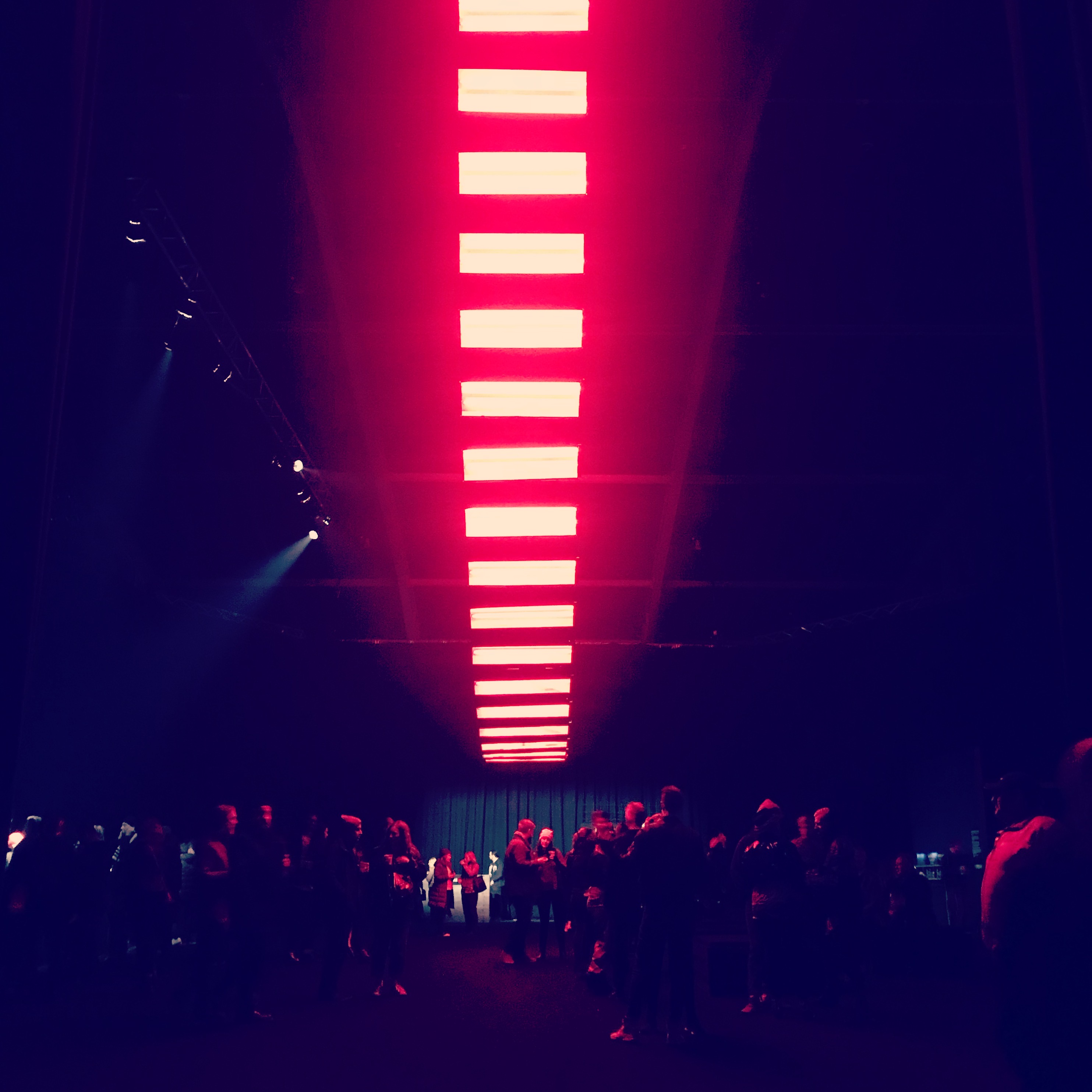
More than any of that. I’m astonished at the level of local buy-in. As you gaze around Hobart, you can see commercial and private buildings all getting into the Dark Mofo spirit. The atrium of the Telstra building is lit up like some ghastly red horror movie scene, as are its neighbours. Dotted about, here and there, they have all decided to join the party – presumably masking their current lighting with red filters or replacing with red bulbs. But here’s the thing. It’s not just any red filter. It’s THE Dark Mofo red. Everywhere. No-one is slightly ‘pink’ or gone for a rusty-red, it’s the luscious, distinctive, blood-curdling Dark Mofo red.

IMG_7522

I’d love to know, are they all supplied with PMS-matched red filters? Have Dark Lab gone to the extent and expense of distributing brand kits across town? And even if they have, how come there are no rogue elements? Or are Hobartians intuitively blessed with on-brand design nous?  Whatever…the fact that it is all consistent astounds me.

The devil is in the detail, as they say. Bravo Creative Director Leigh Carmichael and team. Joyful. Simply, joyful.


Women in design – a personal experience

Woman climbing illustration by malika favre

Today is International Women’s Day…

There will, no doubt, be plenty of articles written about the working and home lives of women, and how inequalities and prejudices are still all too common. How research shows that success and likeability are positively correlated for men and negatively correlated for women (when a man is successful, he is liked by both men and women. When a woman is successful, people of both genders like her less). How women are not making it to the top of any profession anywhere in the world.  Least of all in government –  women make up less than 18% of all government ministers in the world. How, when a woman and a man work full-time and have a child, the woman does x2 the amount of housework the man does, and the woman does x3 the amount of childcare than the man.

You’ll read much of that elsewhere. However, I want to focus on our industry. The creative industries must be better, right? With our progressive attitudes and predilection towards non-conformity? I have to say, my own experiences don’t paint a pretty picture, nor did a quick canvas around my female friends and colleagues in the industry.

A few examples...

Early on in my career as one of the professional ‘public faces’ of a top tier architectural practice I was asked, instead, if I would cover reception on lunch breaks for a while. Surprised to be asked, but young and new and wanting to seem obliging, I agreed. That was until it was pointed out to me by a senior female in the practice that there were plenty of people that could have been asked. Many more junior, freelancers, contractors. That it might not give the greatest impression to our regular visiting contacts, if I was greeting them on reception, only to then hold a meeting with them. Plenty of other options in fact, but….male. They were not asked. As an aside, a recruiter I know in the gaming industry was recently asked to hire a receptionist, female only ”under 30 with big boobs.”

Or the MD of an agency who had a wonderful talent for hiring women and being super-friendly with them in the workplace, yet clearly didn’t take them or their work seriously. It never “quite worked out” having senior women in the agency.  It was clear that they were perceived to be a little ‘pushy’, mirroring the findings of a recent US study that found that women who are seen as nice, modest and self-effacing lack ‘executive presence’. But if they’re hard-driving or ambitious, they’re ‘unlikeable’.

The MD, who, after a dalliance with one of his female members of staff at the office Christmas party was heard saying shortly after “well, I suppose I could always fire her”.

The Chairman and Partners of a practice, who were heard guffawing at the existence of a Women’s Prize for Architecture, “I mean, what on earth are they going to win – a lifetime’s supply of tights?”

The Partner of a practice who, when conducting an Annual Review with a senior female architect who was asking for a pay rise, exclaimed “What on earth do you need that for, your husband is minted, he works in Property!” Speaking of which, data released only last week in the 2016 AR Women in Architecture Survey, show significant discrepancies among male and female salaries at the top of the profession. UK men at director, partner or principal level are earning 31% more. For the creative industries as a whole, the figure from the Office for National Statistics shows a 12% salary gender gap. People – this is more than four and a half decades after the Equal Pay Act was introduced!

But, wait, there is some good news!

Studies show that households with equal earning and equal responsibility for childcare have half the divorce rate. They also have more sex. Is that good enough motivation for everyone?

The London Design Festival 2014: a review

The London Design Festival gets bigger and bigger each year. There were over 300 individual events this year –  enough to give you pavement paralysis hopping from one foot to the other, unsure where to turn next. For the first time since the festival’s inception though, I really felt like it paid to be far more discerning with your time.

There were some gems. The talks and debates at the V&A were superb, as always. Such a variety of topics, and they have the pulling power to bring in the big guns. Typographer Alan Kitching shared some stories of old and new in his most inimitable way, proving his continuing passion for his craft. His recent collaboration with Monotype honouring some of the great names of graphic design can be seen at the LCC in Elephant and Castle until 16 October.

Alan Kitching V&A talk #LDF14

There were also, however, some flops. The flagship installation in the V&A – a mirrored ceiling in the Raphael Galleries by design duo Barber Osgerby – was a clear case of the reality crumbling under the weight of the idea. On paper I’m sure it really worked, but in situ it felt clumsy and fell flat.  

100%design proved that it really has lost its way. Once, it was a destination of discovery with top quality designer-makers sitting alongside only a scattering of commercial, contract furniture. Now it’s like walking through a high-end Homebase…with poor lighting. Designjunction has usurped its position –  firmly placing itself on the map as the go-to destination for a good mix of everything.

My most welcome discovery at Designjunction was the beautiful work of illustrator Malika Favre. Represented by Handsome Frank with prints sold through OutlineEditions at DJ, her monochromatic work has such a mesmerising quality to it.

malika favre illustrator A

Screen Shot 2014-09-25 at 22.04.59

malika favre illustrator C

malika favre illustrator D

malika favre illustrator A balconies 2
Balconiesmalika favre illustrator G

malika favre illustrator kama sutra

malika favre illustrator E

malika favre illustrator rubiks
Images by Handsome Frank

Another stand-out exhibitor at Designjunction this year was Patternity with its collaboration with the Imperial War Museum, London. Drawing inspiration from the iconic Dazzle camouflage patterns painted to disguise and protect ships during the First World War, they have designed a range of products dressed in striking monochrome geometric pattern.

Dazzle Patternity 2

Dazzle Patternity 1

Dazzle Patternity 3


Art, street art + graffiti in London

Here. Be. A selection of the best art, street art and graffiti in London that has made me smile, smirk and downright laugh out loud in recent months.

Things i hate, vandalism irony lists graffiti

There’s no doubt, London has some of the sharpest creative minds around, and I thank my lucky stars, frankly, that I’m now a Londoner.

Millo street art graffiti London

Work by Millo, Shoreditch, London.

Zaha Hadid 3D face Domus Tiles installation

An installation bearing the face of architect Zaha Hadid created by artist Greg Shapter for Domus Tiles, Great Sutton St, London. Hard to see here, but this is actually a 3D installation of tiles that appears comprehensible only when standing in a certain spot across the road.

Phlegm street art shoreditch london

Phlegm The Bestiary

Work by Phlegm – always slightly unnerving! Normally found under various railway bridges and dark alleys, here at the Howard Griffin Gallery in Shoreditch, London, were a large number of fantastical creatures in ‘The Bestiary’. This immersive and large scale installation in wood, clay and plaster gave me the proper heebie-jeebies…

Street art sticker southbank

Used and dirty…?

Street art Running Man

Mature.

Street art Love mural Broadway Market

Wow. Just wow.

Graffiti Hackney

Me too my friend, Me too… Fair comment on the encroaching retail wrecking of Mare St, Hackney.

Funny signage London van

Still, a cosy night’s sleep for a homeless tailor…? Boom boom…

Street art Gregos artist Shoreditch

So, lots of these faces by street artist Gregos have been appearing in London, Paris – his home turf, and now all over the world apparently. Cast from his own face, showing different moods and humour, they are guaranteed to raise a smile.

Borondo graffiti

Sometimes, great street art appears for just a few hours or a day or so, and as quickly as it appears it fades from view. Like this wonderful piece by Borondo in Hackney Wick. Turned up last Saturday afternoon, but by morning some tool had covered over all of it and replaced it with a rubbish tag.  Arggghhh!! (why?)

Umberto giovannini artist london underground

Umberto giovannini artist london underground woodcut

Fabulous wood cut prints by Italian artist Umberto Giovannini, on display at Stour Space, Hackney Wick.

Street art mural EC1 London

Stumbled across this delightful mural on the Whitecross Estate, east London.

Laura Jordan illustration London

These beautiful cityscape illustrations by Laura Jordan are a real pleasure to view. Full of captivating references on the issues facing society today, they combine architectural drawing with illustration in pen, ink and mixed media. She has just opened her own studio/gallery at 273 Hackney Rd – an easy side step on the route between Hackney City Farm and Columbia Rd.

Laura Jordan illustration London riots

Laura Jordan illustration London riots

Brett Amory artist Lazarides

I’m not sure why I like these so much. They are just ordinary scenes of ordinary life in London. But they are beautifully captured in paint. American artist Brett Amory had his first solo show at the Lazarides Gallery, London. Called ‘Twenty Four’, he photographs 24 scenes in the city for one hour at a time, distilling down and capturing the essence of that experience into one representative image.

Brett Amory artist Lazarides Kebab Shop

Brett Amory artist Lazarides face

Brett Amory artist Lazarides face

Brett Amory. Super-intriguing messed up faces…

3D Street art Village Underground Shoreditch

Striking 3D image on the wall of the uber-trendy Village Underground venue, Shoreditch, London.

This blog post is one of a series of design blog posts by design writer Jackie Hawkins.

Coldplay album artwork by Mila Fürstová

Coldplay album artwork from Ghost Stories with permission from Mila Furstova

Stunning Ghost Stories album artwork

The new Coldplay album artwork for Ghost Stories showcases a stunning collection of etchings by artist Mila Fürstová. Now available to view as a full-length animation, along with the opportunity to listen to the album for free ahead of its release on 19 May!

It’s wonderful when nice people get the opportunity to do great things. And so it is with my friend Mila. A talented UK-based Czech artist known for her beautiful etchings, Mila has been secretly beavering away for the last year on this artwork for Ghost Stories - Coldplay’s sixth studio album. What a fabulous commission! How on earth did she manage to keep it a secret?!

Screen Shot 2014-03-04 at 15.54.52

Artwork for ‘Magic’, Coldplay

Included here you can see both the cover art for the Coldplay single Magic released on 3 March 2014, and the Coldplay album cover itself. The Coldplay album is due for release on 19 May 2014 (you can pre-order on iTunes).

Dove by Mila Furstova from Coldplay single Magic on Ghost Stories

The single art for Magic features a symbolic white dove imposed onto a blue canvas. Contained within the perimeter of the dove is a scenario featuring imagery related to stage magic, including a levitating couple, a flying deck of cards and a theatre stage. The level of detail is just gorgeous…

Screen Shot 2014-03-06 at 10.32.53

Angel wings, medieval art-driven artwork

For the Coldplay album artwork cover, the medieval art-driven artwork features a pair of angel wings imposed onto a painting of an ocean under a sky at night. The angel wings themselves feature cryptic imagery of medieval-style drawings including a couple in love, a man facing a mirror, a flight of white doves, a circular maze, a girl by candelight, a window looking out onto an incoming tornado and a garden plant with a ladder. You can zoom in to a larger version of the artwork on Coldplay’s official website, using a screen magnifier – definitely worth doing!

If you fancy one to hang on your wall, or even as a tattoo (the current reproduction of choice on the Coldplay Facebook page right now!), you can buy the artwork through Album Artists, from 19 May.

Images courtesy of Mila Fürstová.

Watch the Coldplay album artwork for Ghost Stories in the Magic video

This blog post is one of a series of design blog posts by design writer Jackie Hawkins.

Sensing Spaces: more ‘miss’ than hit, RA, London

Screen Shot 2014-02-16 at 19.49.16

Grafton Architects

Grafton Architects

Grafton Architects

Everyone seems to have an opinion on ‘Sensing Spaces: Architecture Reimagined’ on at the Royal Academy right now. It appears to be so popular, I wonder whether it will do for the public appreciation of architecture what Anish Kapoor’s hugely visited 2010 exhibition did for sculpture.  It left me however, a little cold.

Continue reading